In my last post, I talked about how to create and give your first speech. While primarily aimed at Toastmasters, giving their icebreaker speech, the 7 concepts apply to almost all presentations. Today I want to expand on those tenets and add a very important one… Contrast. Contrast allows us to differentiate from the good and the bad, the high and the low, and almost any two things that are different.
In life, contrast is a good thing. If everything was white, for instance, we wouldn’t be able to make out doors and walls. Paintings would be impossible. White text on a white sheet of paper would be impossible to read. Contrast is absolutely necessary for life.
So why is it, when many people put together a speech or presentation, they just throw a bunch of facts and bullet points at us. Facts by themselves are boring! I guarantee you that just putting together a speech with a laundry list of facts, you’ll bore your audience to sleep.
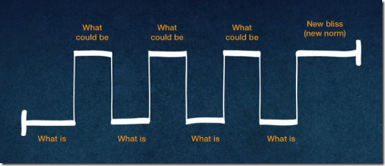
Nancy Duarte, put together an insightful presentation at a TEDx conference on using contrast to make your speeches better. She did extensive research on famous speeches from the past and found a rhythm of contrast that many speakers have employed over the years. This rhythm can be expressed as a sine wave form. The greater the distance between the peaks of the waves, the more effective the speeches were. This contrast made all the difference.

To help us instill contrast in our speeches, I’ve come up with a simple color coordinated speech outline that you can use when building your next speech. It has a place at the top for a powerful opening, that expresses your premise to the audience. In the middle it contains contrasting boxes where you can put the existing problem or condition, and then offer a solution in the contrasting box.

You simply alternate problems (what is) with solutions (what can be) and then move to the close at the bottom of the form where you ask your audience to make a decision and take action. I’ve come up with two color coded documents in MS Word format that have 3 or 4 contrast sections. You simply add the problem in the white boxes and the solutions in the blue.
You can fill these in on your computer in Word, or use the PDF versions with a pen or Sharpie. With this document filled in, practice from it and add emphasis to each contrasting point. The color coded boxes will prompt you to use vocal variety along with appropriate gestures. If you put this on the lectern while speaking, a quick glance will prompt you to add contrast as you compare what is with what can be.
I suggest you include just the main points for each section when filling out the outline. Use a large font or write big with a Sharpie. Use it as a memory or emphasis tool, rather than notes that you read from. The sheet with three contrast points will work well for a 5 to 7 minute speech. The one with four will work for 8 to 10 minute presentations. You can expand as necessary. Have fun with this.
Speech-Contrast-Outline zip file.
Question: Have you used contrast in a speech before?