Yesterday we looked at some of our Social Media Mentor’s Facebook Fan pages. We wanted to see what information they included and get a better idea how to design ours. Today we want to look at Corporate pages and see if we can glean some marketing ideas for our page. Lets take a look at some of the popular ones.
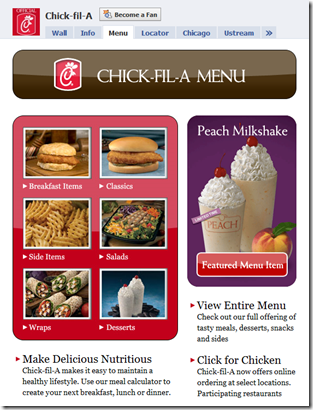
Chick-Fil-A: Has a very product intensive page. They use serif fonts and round edge product boxes which gives their landing page a much softer feel that the square-boxy feel of a standard Facebook page. Overall they have six boxes for their popular products and a larger featured item box for their promotional product of the month. Overall a compelling and simple to navigate design.
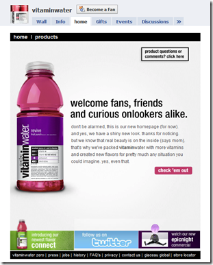
Vitamin Water: Is now using Facebook as their homepage. They obviously must be getting good traction with this to forgo a standard website. Their page looks OK, but it is very basic and would be very easy to click away from. To me, there is nothing compelling me to click further. They have three smaller buttons on the bottom, but they look like standard social media fare with a Twitter button in the middle. Their copy just says welcome. It’s not a clever saying or good copy… just a boring welcome message. They need to take a look at some of the old VW ads and come up with some pithy copy. Overall… I’m not impressed.
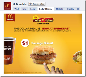
McDonalds: The landing page is a promotion for their one dollar breakfast menu. The food looks appetizing and the message is simple. You can get this sandwich for a buck. It’s simple and effective. With half revealed pictures of other products to each side, it makes you want to click and see what else you can get for a dollar. Overall, this strategy might have some merit. When you click on the graphic it turns into a scrolling Flash presentation show the entire dollar menu. Clever and informative.
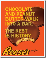
Reeses: Has taken one of their standard product pictures and added great add copy as an overlay. It’s simple but really effective. Vitamin water ought to take an example from this add.
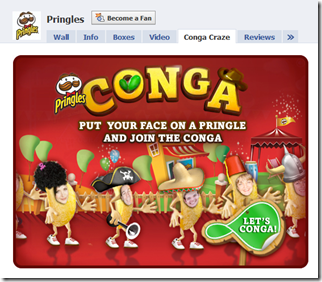
Pringles: Has had their marketing department come up with a fun Flash based interactive game, where you can morph your face onto a Pringles chip and then dance the conga. This is a fun and brilliant strategy. While it falls apart on the phone end, as many phones do not work with Flash, it’s great on a home computer.
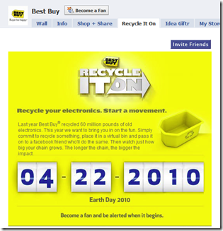
Best Buy: Has taken the idea of doing good for the community and adding it to a tab on their Facebook page. The ad is bright and it offers a recycling service for people who need to get rid of old electronics. It’s a classic example of a win-win strategy and gives you a great reason to visit a Best Buy store.
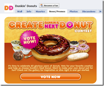
Dunkin Donuts: Has come up with a combination game and voting application to name their next donut. It’s a fun and interactive way to draw customers into their page and allows customers to feel like they have some say in future product development. clever and effective.
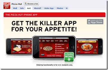
Pizza Hut: Has given their Facebook fans a way to be in constant contact with the company. They have developed an iPhone app that that users can install on their Apple phones or iPod touch. This app allows them to see product releases, online coupons and even a quick way to order pizza from their local Pizza Hut location. Their are quite a few programmers offering to build applications like this and more and more companies are adding them to their online offerings.
Overview… As you can see from the list above, we have a lot of ways to reach out to our audience. As we design our page, let’s keep these in mind and see if we can work some of these ideas into our design.
Question: Which ad do you think was the most effective?
